Showing posts with label 2009. Show all posts

Sunday, March 21, 2010

Armorial Ex Libris I


Armorial Ex Libris

By

Lars C. Stolt

Heraldry is closely related to ex libris as the great bibliophiles during 17th-19th centuries often were armigerous and of course wished to show their coats of arms instead of or combined with their full names or family names in their books. Consequently, many of the earlier ex libris are armorial, and also several ex libris of today depict the coat of arms of the owner. This means that bookplates are one of the best series of examples of personal coats of arms and a source for heraldic studies. An example of that is that many of the pictures of the family coats of arms in Arthur Charles Fox-Davies' well known directory Armorial Families, last edition 1929, displaying ex libris of just one of the family members.

The first ex libris were often hand painted coats of arms on the cover or the front fly-leaf of a book. If we limit ourselves to printed ex libris that are pasted into the book the earliest one may be an armorial wood cut from about 1470 with the coat of arms of Hildebrand Brandenburg, a monk from Biberach in Württemberg (ill. 1). It is kept in several copies in different collections and is so well known that it is reproduced on the tie of the Bookplate Society in Britain (ill. 2).

Armorial Ex Libris III


Not unexpectedly the majority of the armorial plates are British. A fine example of the great plates from the 18th century and a typical royal bookplate is one of the ex libris of the great bibliophile Prince Augustus Frederick, Duke of Sussex, (1773-1843). His library at Kensington Palace had more than 50,000 volumes and was sold at auction after his death. One of the volumes, a heraldic book in Latin printed in1606, was sold in Stockholm in 2004. The ex libris shows the royal arms as born 1801-37 with a label of three points and the ribbon and collar of the Most Noble Order of the Garter; above the ducal coronet the royal crest (ill. 5). The motto SI DEUS PRO NOBIS QUIS CONTRA NOS means "If God is for us, who can be against us". There is a blank oval for the shelf mark, common in these days. The plate is signed "Perkins and Heath Hardened Steel Plate", which means that it was engraved in steel by the American engineer and inventor Angier March Perkins, in England from 1827 specialized in banknote engraving.


The most famous British artist of armorial ex libris was Charles William Sherborn (1831-1912). His copper engravings are unsurpassed and a fine example is the plate he made for the Duke of Westminster, Hugh Lupus Grosvenor (ill. 6). The duke was born in 1825, succeeded his father in 1869 as 3rd Marquess of Westminster and was raised in 1874 to Duke of Westminster. He resided at the castle of Eaton Hall at Chester. The plate was engraved in copper in 1884 and shows his full coat of arms with the ducal coronet and the Garter ribbon and collar with "Great George". The motto VIRTUS NON STEMMA means "Virtue, not pedigree".

Armorial Ex Libris IV


A later master of copper engraving is George William Eve (1855-1914). A fine plate by him was engraved in 1903 for Sir Francis Reginald Wingate, KCB, (ill. 7). It is typical example of the three-dimensional heraldic style in contrast to the flat style common today. The coat of arms contains a portcullis which combined with the crest-motto WIN refers to the family name. KCB means Knight Commander of the Most Honourable Order of the Bath, the ribbon of which with pendent badge encircles the shield. TRIA JUNCTA IN UNO (Three joined in one) is the motto of the order. A KCB is entitled to use the title Sir. Below the shield are four other orders or decorations.

On the European continent the armorial bookplates are not as restricted as in Britain therefore artists take greater liberties with designs. Ernst Krahl (1858-1926) was a heraldic artist to the Imperial and Royal court in Vienna and a very diligent ex libris artist. In 1895 he made a plate, printed in P1, for Baron Carlos de Vaux (ill. 8). The full coat of arms of the baron is surrounded by an elaborate frame of clinging plants. Above the crest the alliance shields of the baron and the baroness are shown. The inappropriate legend "Ex libris des...." (i.e. Bookplate of ...) is not unusual by Krahl.

Armorial Ex Libris V


The other plate by Krahl is printed in heliogravure and shows the arms and the villa of Dr. Hans and Helene Bretschneider von Rechttreu with an interior view from the villa (ill. 9) .

The German emperor and Prussian king Wilhelm II (1859-1941) had an ex libris by professor Emil Doepler (1855-1922) in Berlin (ill. 10). It is an etching created in 1896 and shows the
imperial arms in a nice design with books. The collar of the Prussian order of the Black Eagle surrounds the shield.

Armorial Ex Libris VI


One of the greatest ex libris engravers was the German-Danish artist Friedrich Britze (1870-1956). One of his plates of seal-type was engraved in copper in 1934 for count Reinhold Stenbock (1878-1946), one of the oldest Swedish noble families (ill. 11). During the German occupation of Denmark in the Second World War Friedrich Britze was thoughtless enough to make an ex libris for Werner Best, the German governor in Denmark, resulting on the loss of his position as an engraver to his Majesty the King.

Since heraldry is rich in color it is fairly obvious to have armorial ex libris printed in different colors as soon as it was technically possible. Five heraldic ex libris artists are presented here. Bruno B. Heim (1911-2003) was an archbishop in the Roman Catholic Church and a famous heraldist. The plate for His Excellency Hector Allard was devised by Heim in 1967 when Allard was Canadian Ambassador in Copenhagen where Heim was the Catholic nuncio (ill. 12). Of course the maple leaves refer to Canada; the bookplate is engraved in steel by the German master engraver Rudolf Niedballa (1914- ). The free shape of the lion is typical of Heim

Armorial Ex Libris VII


The most famous Swedish heraldic artist Jan Raneke (1914- ) has made hundreds of ex libris. The plate for Folke Lindskog (1916-1999), a business man in Gothenburg, was drawn in 1980 and printed in P1/4 (ill.13). The linden leaves in the shield refer to his surname.

Dipl-Ing, Dr. Zdenko G. Alexy (1922- ) is a Slovakian heraldist who has made many ex libris in color. The plate for the German heraldist Johannes Krölls (1931- ) was made in 1981 and is printed in P1/7 (ill.14).

The Swedish heraldic artist Jacques de Wærn (1927- ) is represented here by an ex libris for me, president of the Swedish Ex libris Society (ill. 15). Below the shield are the two Royal medals of the Pro Patria Society and the Patriotic Society. And for the first (?) time in an ex libris the medal ribbons of the owner are shown.

Armorial Ex Libris VIII


The Dutch heraldic artist Daniel de Bruin (1950- ) is unconventional in his art. The coat of arms designed by him has challenged many heraldists, being often three-dimensional with shades and palmy figures far from the orthodox flat style. Another peculiarity is that he has many personal bookplates with heraldic connection but none with his own coat of arms and none drawn by him. The plate for David Robert Wooten is typical for de Bruin, was made in 2003 and printed in offset in four colors (ill.16).

Two bookplates with heraldic objects in a milieu deserve to be shown. The German heraldist Lothar Müller Westphal (1941- ) has made a nice ex libris for himself relaxed and naked sitting, reading and smoking with his right arm resting on the shield and with the helmet on his left knee (ill.17). The legend "Us mingem Böcherschaaf" is in Niederrheinisch and the printing method is offset. The other ex libris is a wood engraving by Frank-Ivo van Damme (1932- ) from Belgium who is not a heraldist (ill.18). It was engraved in 1988 and shows in an unorthodox way the coat of arms of Etienne De Ryck and the municipal hall of Lier.

Armorial Ex Libris IX


The Czech heraldist Václav Filip (Wenceslai Wocc), now living in Italy, has an unorthodox approach to the subject of heraldry - sometimes with erotoheraldic motifs. He is represented by a not so erotic alliance ex libris for him and his wife Maria Graziæ, printed in offset. He himself is the naked supporter of the arms (ill.19). With his right hand he is holding his own shield and with his left hand his wife's shield and the helmet is put on his head.

Lastly a heraldic ex libris; in this study we see a bookplate for the well known ex librist and diplomat Benoît Junod, Switzerland. It is strictly a bookplate with the arms of Junod (ill. 20). The shield is surrounded by the collar of Knight of the Sovereign Order of Malta and the small shields are Geneva and Neuchâtel, the cantons of origin of Junod. It is a copper engraving from 1986 by the Swiss artist Paul Aeby.

Armorial Ex Libris X


The fact that the common ex libris of today is the paper ex libris to be pasted into the book does not mean that the super ex libris or supralibros are not used nowadays. A modern super ex libris is seen in illustration 21. It belongs to me and shows the shield of his arms and behind those two batons in saltire of the heraldists of the Order of Carpenters and the Order of Par Bricole respectively. It is designed in 2001 by the young Swedish heraldic artist Magnus Bäckmark (1974- ) and is impressed in gold on the outside of the front cover of a book.

Today the armorial ex libris is experiencing something of a revival, the future looks fine for heraldry with several people commissioning armigerous ex libris. There are now many young heraldic artists offering fresh design interpretations.

Wednesday, November 25, 2009

The Vienna Workshop, I


The “Wiener Werkstatte” and its Ex Libris Artists

The Vienna Workshop

By

Heinrich R. Scheffer

When the Oestereichische Exlibris Gesellschaft (Austrian Ex Libris Society) was established over hundred years ago, it also marked the foundation of the Wiener Werkstätte as a “Cooperative of Craftsmen in Vienna,” whose aim was to promote the financial interests of its members – through teaching and instruction in the arts and crafts; through the making of all different forms of art /…/ designs, and through the establishment of workshops and the sale of their merchandise. The official name in the trade register concealed the initiative of two progressive Viennese artists and of a patron of the arts. They were Josef Hoffmann and Kolo Moser, professors at the arts-school in Vienna, and Fritz Waerndorfer, an art connoisseur and visionary, but most importantly a financially strong banker. They wanted to put into action the rather theoretical program of progressive Viennese artistry, calling it the “Secession” and injecting it with new life. “Stilkunst” (the art of style) should be incorporated into the “collective body of art,” and the works of the secessionists should encompass all areas of life.

Within the secessionist movement, Hoffmann and Moser were in charge of arts and crafts, and they tried to revitalize local or native handicrafts and techniques. These were to be transformed according to new criteria, as it was successfully done by Charles Robert Ashbee in his London workshop. The motto was “Art should be affordable for all” – whereby the craftsman was not working anonymously, as a “production machine” but in collaboration with the designer, and also having contact with the customer.

The Wiener Werkstätte (hereinafter WW) was a flourishing enterprise from its beginnings in 1903 until the company closed down in 1932. It managed to continue to do well even through World War 1, and in 1922 the WW set up a subsidiary in New York City. This company was registered under “Wiener Werkstätte of America Inc.” and had a salesroom at 581 Fifth Avenue. The commodity was therefore well established and much valued by collectors in the USA.

A sensitive modernization in the arts and crafts was noticeable as early as in autumn of 1900, at the VIII Exhibition of the Wiener Sezession (Viennese Secession), at which the works of the Scottish couple Margaret and Charles Rennie Macintosh were presented. First contacts with the British crafts-philosophy and their proponents were made during this time, which led to a lively exchange of ideas. One can draw a direct line from London to Vienna, and Hoffmann and Moser believed that, in a collective workshop, they would most likely be able to implement their new principles.

Initially Hoffmann’s and Moser’s artistic personalities dominated with their designs, but the English influence was highly visible. The black/white contrast, the square, irregular patterns by Macintosh were formative. The quadrat as ornament became the logo for Josef Hoffmann’s trellis decors; and the geometric shapes, such as the sphere, the cube, the ashlar or the cylinder, which were, at least during the first years of production the main features of design of the Vienna Workshop’s manufactured items. The monogram of the WW, and its registered trademark – the Rose label –and the signets of each employee also show the basic quadratic elements.

The Vienna Workshop, II


Japanese sensibilities for art and form strongly influenced Viennese artists around the turn of the century. They saw that the art of space, the usefulness and use of material were not only recognized by the English, but also by the Japanese. In their work plan, published in 1905, function and intended purpose of a product were the overriding objective, because “we emanate from the intended purpose, usability is our basic requirement.”

The products of the WW were shown through exhibits within the country as well as abroad, and in a short period of time received recognition. In 1904 these products were shown in Berlin; in 1905 at the Gallery Miethke in the gallery’s Vienna showrooms, formerly used by a schismatic Klimt-clique. They were also shown in 1906 in London and in 1908 at an art exhibit in Vienna. The WW became international by establishing sales branches abroad: 1917 in Zurich, 1922 in New York and 1929 in Berlin.

WW products, even though they appealed to people because of their simplicity and contemporary style, were not really understood and were bought by a small fraction of the bourgeoisie. The artisans of the WW were swayed by a dream about “collective art work,” which they were able to fulfill between 1905 and 1911. However, they were not able to do it in Vienna, but in Brussels, after Baron Adolphe Stoclet awarded them a contract to build a palace for him. Everything, from architectural design to flatware was to be supplied by the WW. Hoffmann was able to hire the best craftsmen. Artist Gustav Klimt designed the mosaic frieze in the dining room, Ludwig Heinrich Jungnickel painted an animal frieze in the nursery, Berthold Loeffler did the tiles and majolicas. Also employed in this project were the sculptor-couple Luksch, Michael Powolny, Kolo Moser, Carl Otto Czeschka and Leopold Forstner.

Also important to the WW was the book and its décor. As stated in its work plan:
The machine works diligently and fills our bookcases with works of inadequate print. They are very low priced, but every cultural individual should be ashamed about the glut of material, because every production entails lesser responsibility and
leads to superficiality. How many books are really ours? And should one not own these books – with great jackets, printed on the best paper, bound in beautiful leather? We may have forgotten that the love, with which a book is printed, prepared and bound, makes for a special connection. That to be surrounded by beautiful objects makes us feel more beautiful ourselves. A book as a whole should be a work of art and should be valued as such. What an admission of the superior character of a book; a keen reminder of the quality of the whole – including an important detail in the book, the Ex libris.

The firm also included publishing; Oskar Kokoschka’s poem “Die Träumenden Knaben” (“Boys Dreaming”) of eight colored lithographs was released in 1908.
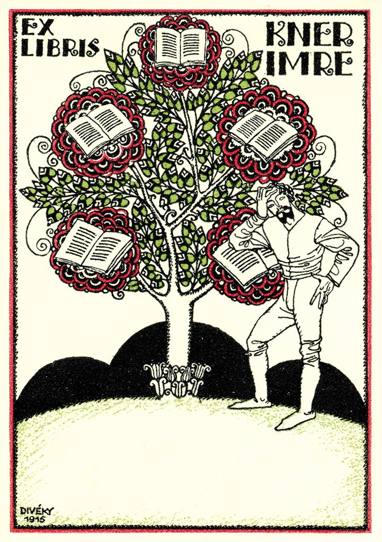
The WW also published a famous postcard series, which fetched top prices, and employed many other artists, such as Egon Schiele, Rudolf Kalvach, Ludwig Heinrich Jungnickel, Richard Teschner and Josef von Diveky. Also published were other, seemingly unimportant things of daily life, such as sheets of pictures, place cards, menus or labels (for wine bottles). It would have been an obvious step from this commercial art form to extend to the ex libris. Interestingly, the step was not made. No universal ex libris of the WW’s publishing company is known. The potential group of buyers was financially able to afford their own individual ex libris, created by an important artist; mass production not being acceptable to them. Still, a hint of commercial art was associated with these individual ex libris, because of an overabundance of bookplates created by minor artists or by amateur designers of this era.

The Vienna Workshop, III


EX LIBRIS ARTISTS

The pool from which artists for the WW were acquired was for most part the “Kunstgewerbeschule” (School for Applied Arts), which was affiliated with the Austrian Museum for Art and Industry. The museum was founded in 1864 and the school became a part of it in 1867. Thirty years later the school underwent a reform and as a result became one of the most progressive art schools on the continent. The reform was made possible by a member of the board of trustees, Otto Wagner, architect and professor at the Viennese Academy, who believed that ”Kunst im Handwerk” (industrial art) needed to be advanced. Teachers were appointed who were exponents of a modern “constructive principle,” a so-called “Nutzstil” (useful style). A whole generation of teachers had to be replaced by “Secessionists.” Chief principals of these master classes were Kolo Moser, Josef Hoffmann and later Alfred Roller.

Ample talent was available from the influx of different peoples of the monarchy who during their years of study were sent by their teachers to work at the WW. Over time, about 200 artists have made more or less important contributions to the Vienna Workshop – and thus established an important reference for themselves.

While still in school, the students were introduced to the design of ex libris, and the School for Art and Design – today the University for Applied Arts – time and again arranged ex libris competitions. According to an account by Alfred Roller in the ÖEG yearbook (1910) about such a contest, sponsored by Dr. von Brücke, fifteen etched designs were available. Typical for the New Style of that time were submissions from Josef von Diveky (1887–1951) and from Rudolf Kalvach (1883–1932) – who later on frequently created ex libris’ in their artistic paths.

Through the multitude and wide spectrum of artistic functions to which the WW artists dedicated themselves, there remained limited time for bookplates, and none of them can therefore be classified as an ex libris artist. Ex libris attributed to artists from the WW are therefore very scarce.

These ex libris have a unique flair in any ex libris collection. They are different from other bookplates because of their motifs, ornaments and typography. The graphic element predominates, the laminar is in the foreground, and the physical notion is downplayed or completely negated. Figurative depictions prevail in their choices of motifs and are clearly brought into focus. Symbolism and landscapes play a minor part. Ornaments in strict geometric forms, as made by Dita Moser, or the more playful Dagobert Peche designs, are an important feature in ex libris. This is perpetuated in the type, which is succinctly, with great imagination and often dominantly engraved on a bookplate. This led to theoretical considerations, and some artists applied themselves only to the lettering and its theory. The graphics on the bookplates also determine the technique of reproduction which was mostly made into a printing plate or lithographically completed. Traditional gravure techniques were not applied.

The Vienna Workshop, IV


Perhaps the most quoted ex libris in this context is the bookplate for Fritz Warendorfer, drawn by Kolo Moser (Vienna 1868 – 1918 Vienna). Moser studied at the Wiener Academy (Academy of Vienna) and at the Art Academy, where he held a professorship from 1900 – 1918. He was a co-founder of the Wiener Sezession and made numerous graphic contributions to the journal Ver Sacrum. He was probably one of the most talented all-around artists in Vienna at the turn of the century. One should also point out his organizing ability. Moser’s impact lies in the fact that early on he saw a pictorial trend for applied arts and therefore preached a reflection on simplicity and authenticity; also stressing usefulness and reliance on architectural ideals. His role models were Otto Wagner and his colleague Josef Hoffmann. The implementation of his ideas in a conservative Vienna took some determination, but he succeeded with the full support of the Secession.

Moser’s wife, Dita Moser, nee Mautner von Markhof (1883–1969) was also a graphic artist and designer. She studied at the Kunstgewerbeschule (School for Applied Arts) and made her mark at the WW by designing calendar sheets, toys for children and a deck of tarot card. The geometric clarity of these cards was appreciated as it represented the new style of functional graphics. The print was marginal, the usability was limited because of the idiosyncratic design of these cards, however, they were much sought-after by card collectors.

The ex libris for Editha Mautner von Markhof, Baronin Sustenau, created in 1907, is a good example for the style in which the quadrat – Hoffmann’s basic element – illustrates an important structure. It is actually a modern crest ex libris, showing the family crest of the industrial family Mautner von Markhof with a turret and a shamrock, still used as a trademark today on products of their company, Mautner Markhof. The same goes for the “archer”, the escutcheon of Barons Sustenau von Schützenthal. What a difference these are when compared with the excessive heraldic plates by Ernst Krahl, which were made at the same time.

The Vienna Workshop, V


Alfred Roller (1864-1935) was professor at the Kunstgewerbeschule and its director from 1909 – as well as a founding member of the Viennese Secession. Roller had close relations to the theater and initially designed costumes for the cabaret Fledermaus. He then collaborated with Max Reinhardt in Berlin, for whom he created countless stage designs and later became executive director for décor at the Wiener Staatstheater. His exlibris for Fritz Oberndorfer (1899) is a good example of the art movement of the early Secessionists. It is steeped in intellect with a balanced image-format where “not the professional activity but the true identity of the owner may be manifested in his Exlibris.” (Alfred Roller)

Another student at the same Kunstgewerbeschule was Berthold Loeffler (1874–1960). He took over a professorship in 1907, after Carl Otto Czeschkas’ move to Berlin. He taught art classes and held a workshop for print technology. He was a professor at the school until 1935. In addition to ceramic works, which he created together with Michael Powolny and the “Viennese Ceramics” – he applied himself to a variety of graphic works, such as book illustration, postcard design, posters, and general design. Loeffler created only a few exlibris, among them the two important and well known bookplates for psychoanalyst Sigmund Freud of Vienna and the poet Arthur Schnitzler. The ex libris for Loeffler’s wife Melitta (born Feldkirchner) is a beautiful example of the effortless, succinct style expressed by artists in the WW. His wife, often Loeffler’s model, was also an artist, known for her embroideries, which she designed and crafted in collaboration with the WW.

Oskar Kokoschka (1886-1980) was a student of Berthold Loeffler at the Kunst-gewerbeschule and in the early years of his artistic career Kokoschka was strongly influenced by him. He outgrew his teachers and colleagues as a painter, as a graphic artist and as a man of letters. Kokoschka worked for the WW from 1907 to 1909 and also participated as a staff member in the Fledermaus décor. Kokoschka designed 15 postcards and several prints, and caused a sensation with the above mentioned story-book, “Die Träumenden Knaben” (“Boys Dreaming”) featuring eight magnificent lithographs.

Kokoschka’s ex libris for Emma Bacher shows his expressionistic, revolutionary style, which for Austria around that time was quite remarkable. The bookplate was displayedin the yearbook of the Oestereichische Exlibrisgesellschaft in 1909 as a sample of Kokoschka’s art work, and was received with spontaneous praise: “Perhaps this sorcerer’s apprentice will one day be revered as an old master.” Though Kokoschka lived a long time, he left only fourteen exlibris prints.

Emma Bacher was the wife of the Viennese jeweler and wealthy patron of the arts, Paul Bacher. Bacher acquired his gallery in 1904 to accommodate the Klimt-faction which had split with the Secession - to give them a showroom. In 1907, after the death of her husband, Emma Bacher took over the gallery and further cultivated the contact with its artists: Gustav Klimt, Kolo Moser, Alfred Roller, Emil Orlik, and others. Thus the contact to Oskar Kokoschka was established here as well.

The Vienna Workshop, VI


Emma Bacher was also familiar with Richard Teschner (1879–1948) and married him in 1911. Teschner studied in Prague at the Kunstakademie (Academy of the Arts) and in 1900 briefly attended classes at the Kunstgewerbeschule in Vienna. He became wellknown for his puppet-shows, exhibiting his famous “Figurenspiel” (bodies reflected in a mirror), modeled on East-Asian culture. The Marionetten-Buehne (Puppet Theater) is alive today at the Theatermuseum in Vienna, and performances continue in the Teschner “Spiel” tradition. Teschner’s relocation to Vienna in 1909 was intimately connected with the WW. His work there included postcards, sculptures, metal works and book illustration. Free from financial responsibilities through his marriage to Emma Bacher, he joined the Klimt-circle, but did not identify himself with their spirit of revolutionary freedom, which to him seemed rather dogmatic. He remained true to his own style, which is more figurative, with playful ornaments of a grotesque and fantastic subject matter.

Like many other artists, Richard Teschner was multi-talented: a painter-engraver, a costume designer, and lute builder. He worked in different graphic-techniques, such as book illustration, posters, and numerous ex libris. One hundred and nine bookplates were found in his estate. The exlibris for Professor Arnold Epstein (1904) was made in his early days in Prague.

Anton Kling was a contemporary of Teschner (1881–1963). He received his education at the Kunstgewerbeschule between 1898 and 1903. His teachers were Josef Hoffmann and Alfred Roller. Kling belonged to the first generation of students who were taught by modern teachers of that institution, and who later became active in the Vienna art scene. Some of these art-students later became teachers and went on to teach not only in Austria’s Crown Lands, but also in neighboring Germany, where they successfully passed on the original Viennese art to their students.

One of them, the first Viennese at the Kunstgewerbeschule in Hamburg, was Carl Otto Czeschka (1878–1960). He brought with him Richard Luksch and Franz Carl Delavilla; the latter held a position as a design-teacher in Magdeburg (1909) as well as in Hamburg. Josef Maria Olbrich was employed in Darmstadt, where he became co-founder of an artists-colony. In 1911 another Viennese, Emanuel Josef Margold (1889–1962) joined the colony.

Anton Kling came to Hamburg in 1908, a move that was mediated by Czeschka. In 1923 he went on to Pforzheim, where he gave new impulse to jewelry design.

The Vienna Workshop, VII


Anton Kling received recognition from Josef Hoffmann in his diploma, stating:
“his brilliant talent and resourcefulness in architectural design, as well as his taste and perception.” Kling played a part as a “decorative assistant” for the Fledermaus when working for WW. In 1908 his work was relevant in organizing the “Wiener Kunstschau” (Vienna Art Exhibition) where some of his ex libris’ – among his other works – were shown. Thirteen of his bookplates are well known. An early ex libris for the painter Magda Mautner von Markhof beautifully balances the ornamental element with a landscape.

One of the few artists who worked for the WW without preparation at the
Kunstgewerbeschule, was Dagobert Peche (1887–1929). He became interested in the arts and crafts movement after his studies at the Technische Universität (Institute of Technology) in Vienna; then as a student of architecture at the Wiener Akademie, which he left in 1911 to work as a freelance design artist. In 1915 he was invited by Josef Hoffmann to join the staff at the WW – where he was able to assert himself with his more playful, ornamental style – and prevail by giving critical new impulses. He also had important ideas for jewelry-, enamel-, tortoiseshell- and ivory design; and for metal-works and goldsmith-design. In the end his style prevailed in the entire production. Through export of WW’s merchandise, Peches also received name recognition abroad. Last but not least, he became the representative of the WW at their base in Zurich vom 1916 to 1918.

Dagobert Peche was also devoted to books and designed book-covers and some ex libris. The bookplate with his name shows how Peche’s style changed since the first decade at the WW, in which the geometric style was replaced with freer graphics.
His bookplate for Wilhelm Baumgartner shows an aging harlequin in front of a curtain, and the rhombs in his costume highlight the black and white contrast.

Another artist who needs to be mentioned in connection with the WW is the type designer Rudolf von Larisch (1856–1934). He was a consultant to the WW from the beginning, and the typeface used by the WW for forms, invitations, announce-ments, etc., shows his influence. WW’s famous company emblem from 1903 and Larisch’s ex libris clearly show the same type font design. Larisch began teaching at the Kunstgewerbeschule in 1902, at the Graphic “Lehr- und Versuchsanstalt,” and at the Wiener Academie and he applied himself to the theoretical and practical side of letters. He wrote numerous important essays about, for example, writing as related to art, and the legibility of ornamental letters. Larisch was an important proponent of the reformation of the art of writing. By developing a new style of writing, he set a benchmark for its daily requirement. Readability was his maxim; theoretical studies, the layout of letters, the connectedness of letter-endings and the meaning of the spacing between letters have supported his theory. His teaching was not only about type design, but most of all to promote the appreciation for new type fonts. His importance was the expansion of this vision and its acceptance for daily use.

The Vienna Workshop VIII


One can name many more artists who, on one hand made their contributions to the Wiener Werkätte, but who also created ex libris. To list them all would go beyond the scope of this essay. It has to be said, however, that the style to which the artists of WW felt committed, lives on to this day in its effectiveness and good taste; moreover, the era still greatly affects our sense of style and it is an important part of the cultural identification in central Europe.


Literature:

Peter Vergo: Art in Vienna 1898 – 1918. London : Phaidon Press, 1975.
Werner J. Schweiger: Wiener Werkstätte, Kunst und Handwerk, 1903–1932. Wien : Edition Christian Brandstätter, 1982. English version published by Thames & Hudson.
Michael Pabst: Wiener Graphic um 1900. Munchen : Verlag Silke Schreiber, 1984.
Werner J. Schweiger: Aufbau und Erfüllung. Gebrauchsgraphic der Wiener Moderne. Wien-Munchen : Edition Christian Brandstätter, 1988.
Heinrich R. Scheffer: 100 Jahre Österreichisches Exlibris. Wien : Österreichische
Exlibris Gesellschaft/Österreichischer Kunst- und Kulturverlag, 2004.
Jahrbücher der Österreichischen Exlibris Gesellschaft: 1907, 1909, 1910, 1912, 1918, 1929, 1949/51, 1992/93.

Picture credits: Scheffer Collection, Vienna, Austria.

About the author: Heinrich R. Scheffer, born in 1942, studied chemistry in Vienna.
He has lived abroad for 17 years and is presently a Manager in a globally operating chemical company, with an office in Munich. For 33 years he has devoted his free time to collecting, publishing and organizing events connected to exlibris and contemporary Austrian art graphics. Between 1987 and 1991 he supported the development of Austrian art graphics by establishing and organizing the contest “FINGERPRINTS” for young artists. He has been President of the Österreichische

Exlibris Gesellschaft (Austrian Ex Libris Society) since 2000. He lives and works in Munich and Vienna.

Thursday, August 6, 2009

Don Quixote (Quijote) on Ex Libris I


Don Quixote (Quijote) on Exlibris

By

JoAnn Pari-Mueller

"Youngsters read it (Don Quixote's story), grown men understand it, and old people applaud it." So wrote Miguel de Cervantes Saavedra, author of the immortal story, Don Quixote.

History. Cervantes, a contemporary of William Shakespeare, was born in Spain in 1547 and led quite a fascinating life. His first poems were written as early as 1567. He served years in the Spanish army under Philip II and in 1571, during the Battle of Lepanto, suffered a gunshot wound which caused permanent damage to his left hand. Then, in 1575, en route to Spain, his ship was captured by Barbary pirates and he was sold into slavery in Algiers. He made four unsuccessful attempts to escape. Trinitarian friars paid his ransom in 1580. In 1582 his first plays were performed and in 1584 at the age of 37, he married a young woman 20 years his junior. By 1587 he was a quasi-government official who traveled widely around Spain, requisitioning wheat and olive oil. He became an aspiring dramatist and a tax collector, but was imprisoned again in 1597 - this time for a shortfall in taxes collected and irregularities in his accounts.

Drawing on his vast variety of life experiences, he finally published Part 1 of Don Quixote in 1605 (at age 57!). It was an immediate success; ten years later he published Part 2. In addition to Don Quixote, he published other novels, short stories, and poems during this decade. He died in 1616, a few days after Shakespeare.

Don Quixote, considered by many to be the first truly modern novel, marked its 400th anniversary in 2005 with worldwide celebrations and symposiums. It has been translated into more than 70 languages and continues to be newly translated by each generation so as to adapt to the changes in nuances of language. Differences in translations can range from subtle to extreme. It won the Norwegian Nobel Institute's "Best Work of Fiction Ever" survey, conducted in 2002; 100 prominent authors from over 50 countries responded to the poll.

Don Quixote (Quijote) on Ex Libris III


Influences on the World. The novel has inspired many artists such as William Hogarth in the 1700s, Gustav Dore in the 1800s, and Salvador Dali and Pablo Picasso in the 1900s. In the 1700s, the French gobelin tapestry industry also created a popular series of four scenes from the story.

It has prompted musical pieces to be written by composers ranging from the classical era Richard Strauss (Opus 35 for cello, performed by prominent musicians such as Yo-Yo Ma) to contemporary folk song writer Gordon Lightfoot. Who could ever forget the song, "The Impossible Dream," from the Broadway Musical, "Man of La Mancha?" This musical was adapted for the stage by Dale Wasserman, music was written by Mitch Leigh, and lyrics were by Joe Darion. It opened in 1965 off-Broadway; with over 2,328 performances it was the third longest running musical of the 1960s.

Filmmakers have also found the story motivational. There have been several popular versions made for the big screen as well as for television. A famous version from 1973 features Peter O'Toole and Sophia Loren. In 2003, a retired business professor from Harvard University even made a film entitled "Passion and Discipline: Don Quixote's Lessons for Leadership."

The world of dance has not been immune to its influence. First created for the Russian Bolshoi Theater in 1869, the Don Quixote Ballet is now performed by famous dance companies the world over. The music was composed by Ludwig Minkus, who was born in Vienna in 1826.

Several words or phrases have become part of our everyday language. To be "quixotic" is to be imaginative, courageous, but usually foolishly so - with an impractical pursuit of ideals; the admirable and the futile combined. "Tilting at windmills," refers to expending one's energy in a futile attack on what cannot be overcome.

Therefore, few genres or mediums remain untouched by this masterpiece. Playing cards, postage stamps, computer games, statuettes, and other memorabilia help keep Quixote's memory alive. There is even a male agouti (a large rodent) namesake at the Wellington Zoo in Australia and a U.S. Don Quixote Solar System Mission whose goal is to crash a spaceship into an asteroid in 2007.

Don Quixote (Quijote) on Ex Libris IV


Ex Libris. As of 2003, at least 2,200 Don Quixote exlibris had been produced by about 800 artists, from over 50 countries, for over 900 owners. European owners are numerous, with the largest number of collectors, not surprisingly, among the Spanish. There are also avid owners in the Americas and the Far East. Peter Hosokawa (1932-1997) and Dr. George Sekine are two Japanese enthusiasts who have commissioned several editions. Although Hosokawa amassed over 1,000 ex libris with this topic, he never commissioned Japanese artists. Sekine, on the other hand, has utilized Japanese artists; some of these depictions have portrayed Don Quixote as a Samurai (Japanese knight). (4)

Vodrazka (1894-1984), from Prague, is the artist given the distinction of having produced the largest number of Don Quixote exlibris (more than 150), with Eduardo Dias Ferreira (1925-1991), from Portugal, creating over 100. When was the Don Quixote topic first used in exlibris? Authorities vary in their estimate, but possibly as early as 1770, although probably not until the late 1800s. (6)

The most common subject areas are: 1. Quixote in armor, 2. Quixote on his horse, 3, Rocinante, 4. Quixote and books, 5. Quixote and Sancho Panza; 6. Quixote and other characters (most often Dulcinea), 7. Quixote and some representation of death or religion, 8. Quixote and other miscellaneous items or themes, 9. Cervantes.

Stylistically they range from realistic to abstract. Techniques used to produce them include metal plate engravings and etchings, woodcuts and wood engravings, lithographs, serigraphs and other photo processes.

Although there is not a great deal of literature regarding "Cervantine" exlibris, there are exhibition pamphlets, sections of exhibition catalogues, occasional articles in specialized magazines, several books, and at least one doctoral dissertation that have described the topic of Don Quixote on exlibris. Some offer the reader excellent reproductions, occasionally tipped-in originals, and interesting text. (3), (5), (6)

"Can we ever have too much of a good thing?" asks a friend of Don Quixote in Part 1. It appears that we'll never have enough exlibris using the theme of Don Quixote. Anyone who is easily able to lose him or herself in any sort of fiction is in some degree a Quixote. (1) Dr. Sekine mentioned in his paper that he used "Don Quixote" as his pen name because "Non Qui" has the meaning of carefree or easy-going in Japanese which appealed to him. (4) The legacy of Cervantes is that "the novelist teaches the reader to comprehend the world as a question." (2) The innocence of Don Quixote in his pursuit of his dream will continue to attract ex libris enthusiasts and artists alike.

Grateful acknowledgement to Luigi Bergomi, for his loan of literature and ex libris.