Wednesday, November 25, 2009

The Vienna Workshop, I


The “Wiener Werkstatte” and its Ex Libris Artists

The Vienna Workshop

By

Heinrich R. Scheffer

When the Oestereichische Exlibris Gesellschaft (Austrian Ex Libris Society) was established over hundred years ago, it also marked the foundation of the Wiener Werkstätte as a “Cooperative of Craftsmen in Vienna,” whose aim was to promote the financial interests of its members – through teaching and instruction in the arts and crafts; through the making of all different forms of art /…/ designs, and through the establishment of workshops and the sale of their merchandise. The official name in the trade register concealed the initiative of two progressive Viennese artists and of a patron of the arts. They were Josef Hoffmann and Kolo Moser, professors at the arts-school in Vienna, and Fritz Waerndorfer, an art connoisseur and visionary, but most importantly a financially strong banker. They wanted to put into action the rather theoretical program of progressive Viennese artistry, calling it the “Secession” and injecting it with new life. “Stilkunst” (the art of style) should be incorporated into the “collective body of art,” and the works of the secessionists should encompass all areas of life.

Within the secessionist movement, Hoffmann and Moser were in charge of arts and crafts, and they tried to revitalize local or native handicrafts and techniques. These were to be transformed according to new criteria, as it was successfully done by Charles Robert Ashbee in his London workshop. The motto was “Art should be affordable for all” – whereby the craftsman was not working anonymously, as a “production machine” but in collaboration with the designer, and also having contact with the customer.

The Wiener Werkstätte (hereinafter WW) was a flourishing enterprise from its beginnings in 1903 until the company closed down in 1932. It managed to continue to do well even through World War 1, and in 1922 the WW set up a subsidiary in New York City. This company was registered under “Wiener Werkstätte of America Inc.” and had a salesroom at 581 Fifth Avenue. The commodity was therefore well established and much valued by collectors in the USA.

A sensitive modernization in the arts and crafts was noticeable as early as in autumn of 1900, at the VIII Exhibition of the Wiener Sezession (Viennese Secession), at which the works of the Scottish couple Margaret and Charles Rennie Macintosh were presented. First contacts with the British crafts-philosophy and their proponents were made during this time, which led to a lively exchange of ideas. One can draw a direct line from London to Vienna, and Hoffmann and Moser believed that, in a collective workshop, they would most likely be able to implement their new principles.

Initially Hoffmann’s and Moser’s artistic personalities dominated with their designs, but the English influence was highly visible. The black/white contrast, the square, irregular patterns by Macintosh were formative. The quadrat as ornament became the logo for Josef Hoffmann’s trellis decors; and the geometric shapes, such as the sphere, the cube, the ashlar or the cylinder, which were, at least during the first years of production the main features of design of the Vienna Workshop’s manufactured items. The monogram of the WW, and its registered trademark – the Rose label –and the signets of each employee also show the basic quadratic elements.

The Vienna Workshop, II


Japanese sensibilities for art and form strongly influenced Viennese artists around the turn of the century. They saw that the art of space, the usefulness and use of material were not only recognized by the English, but also by the Japanese. In their work plan, published in 1905, function and intended purpose of a product were the overriding objective, because “we emanate from the intended purpose, usability is our basic requirement.”

The products of the WW were shown through exhibits within the country as well as abroad, and in a short period of time received recognition. In 1904 these products were shown in Berlin; in 1905 at the Gallery Miethke in the gallery’s Vienna showrooms, formerly used by a schismatic Klimt-clique. They were also shown in 1906 in London and in 1908 at an art exhibit in Vienna. The WW became international by establishing sales branches abroad: 1917 in Zurich, 1922 in New York and 1929 in Berlin.

WW products, even though they appealed to people because of their simplicity and contemporary style, were not really understood and were bought by a small fraction of the bourgeoisie. The artisans of the WW were swayed by a dream about “collective art work,” which they were able to fulfill between 1905 and 1911. However, they were not able to do it in Vienna, but in Brussels, after Baron Adolphe Stoclet awarded them a contract to build a palace for him. Everything, from architectural design to flatware was to be supplied by the WW. Hoffmann was able to hire the best craftsmen. Artist Gustav Klimt designed the mosaic frieze in the dining room, Ludwig Heinrich Jungnickel painted an animal frieze in the nursery, Berthold Loeffler did the tiles and majolicas. Also employed in this project were the sculptor-couple Luksch, Michael Powolny, Kolo Moser, Carl Otto Czeschka and Leopold Forstner.

Also important to the WW was the book and its décor. As stated in its work plan:
The machine works diligently and fills our bookcases with works of inadequate print. They are very low priced, but every cultural individual should be ashamed about the glut of material, because every production entails lesser responsibility and
leads to superficiality. How many books are really ours? And should one not own these books – with great jackets, printed on the best paper, bound in beautiful leather? We may have forgotten that the love, with which a book is printed, prepared and bound, makes for a special connection. That to be surrounded by beautiful objects makes us feel more beautiful ourselves. A book as a whole should be a work of art and should be valued as such. What an admission of the superior character of a book; a keen reminder of the quality of the whole – including an important detail in the book, the Ex libris.

The firm also included publishing; Oskar Kokoschka’s poem “Die Träumenden Knaben” (“Boys Dreaming”) of eight colored lithographs was released in 1908.
The WW also published a famous postcard series, which fetched top prices, and employed many other artists, such as Egon Schiele, Rudolf Kalvach, Ludwig Heinrich Jungnickel, Richard Teschner and Josef von Diveky. Also published were other, seemingly unimportant things of daily life, such as sheets of pictures, place cards, menus or labels (for wine bottles). It would have been an obvious step from this commercial art form to extend to the ex libris. Interestingly, the step was not made. No universal ex libris of the WW’s publishing company is known. The potential group of buyers was financially able to afford their own individual ex libris, created by an important artist; mass production not being acceptable to them. Still, a hint of commercial art was associated with these individual ex libris, because of an overabundance of bookplates created by minor artists or by amateur designers of this era.

The Vienna Workshop, III


EX LIBRIS ARTISTS

The pool from which artists for the WW were acquired was for most part the “Kunstgewerbeschule” (School for Applied Arts), which was affiliated with the Austrian Museum for Art and Industry. The museum was founded in 1864 and the school became a part of it in 1867. Thirty years later the school underwent a reform and as a result became one of the most progressive art schools on the continent. The reform was made possible by a member of the board of trustees, Otto Wagner, architect and professor at the Viennese Academy, who believed that ”Kunst im Handwerk” (industrial art) needed to be advanced. Teachers were appointed who were exponents of a modern “constructive principle,” a so-called “Nutzstil” (useful style). A whole generation of teachers had to be replaced by “Secessionists.” Chief principals of these master classes were Kolo Moser, Josef Hoffmann and later Alfred Roller.

Ample talent was available from the influx of different peoples of the monarchy who during their years of study were sent by their teachers to work at the WW. Over time, about 200 artists have made more or less important contributions to the Vienna Workshop – and thus established an important reference for themselves.

While still in school, the students were introduced to the design of ex libris, and the School for Art and Design – today the University for Applied Arts – time and again arranged ex libris competitions. According to an account by Alfred Roller in the ÖEG yearbook (1910) about such a contest, sponsored by Dr. von Brücke, fifteen etched designs were available. Typical for the New Style of that time were submissions from Josef von Diveky (1887–1951) and from Rudolf Kalvach (1883–1932) – who later on frequently created ex libris’ in their artistic paths.

Through the multitude and wide spectrum of artistic functions to which the WW artists dedicated themselves, there remained limited time for bookplates, and none of them can therefore be classified as an ex libris artist. Ex libris attributed to artists from the WW are therefore very scarce.

These ex libris have a unique flair in any ex libris collection. They are different from other bookplates because of their motifs, ornaments and typography. The graphic element predominates, the laminar is in the foreground, and the physical notion is downplayed or completely negated. Figurative depictions prevail in their choices of motifs and are clearly brought into focus. Symbolism and landscapes play a minor part. Ornaments in strict geometric forms, as made by Dita Moser, or the more playful Dagobert Peche designs, are an important feature in ex libris. This is perpetuated in the type, which is succinctly, with great imagination and often dominantly engraved on a bookplate. This led to theoretical considerations, and some artists applied themselves only to the lettering and its theory. The graphics on the bookplates also determine the technique of reproduction which was mostly made into a printing plate or lithographically completed. Traditional gravure techniques were not applied.

The Vienna Workshop, IV


Perhaps the most quoted ex libris in this context is the bookplate for Fritz Warendorfer, drawn by Kolo Moser (Vienna 1868 – 1918 Vienna). Moser studied at the Wiener Academy (Academy of Vienna) and at the Art Academy, where he held a professorship from 1900 – 1918. He was a co-founder of the Wiener Sezession and made numerous graphic contributions to the journal Ver Sacrum. He was probably one of the most talented all-around artists in Vienna at the turn of the century. One should also point out his organizing ability. Moser’s impact lies in the fact that early on he saw a pictorial trend for applied arts and therefore preached a reflection on simplicity and authenticity; also stressing usefulness and reliance on architectural ideals. His role models were Otto Wagner and his colleague Josef Hoffmann. The implementation of his ideas in a conservative Vienna took some determination, but he succeeded with the full support of the Secession.

Moser’s wife, Dita Moser, nee Mautner von Markhof (1883–1969) was also a graphic artist and designer. She studied at the Kunstgewerbeschule (School for Applied Arts) and made her mark at the WW by designing calendar sheets, toys for children and a deck of tarot card. The geometric clarity of these cards was appreciated as it represented the new style of functional graphics. The print was marginal, the usability was limited because of the idiosyncratic design of these cards, however, they were much sought-after by card collectors.

The ex libris for Editha Mautner von Markhof, Baronin Sustenau, created in 1907, is a good example for the style in which the quadrat – Hoffmann’s basic element – illustrates an important structure. It is actually a modern crest ex libris, showing the family crest of the industrial family Mautner von Markhof with a turret and a shamrock, still used as a trademark today on products of their company, Mautner Markhof. The same goes for the “archer”, the escutcheon of Barons Sustenau von Schützenthal. What a difference these are when compared with the excessive heraldic plates by Ernst Krahl, which were made at the same time.

The Vienna Workshop, V


Alfred Roller (1864-1935) was professor at the Kunstgewerbeschule and its director from 1909 – as well as a founding member of the Viennese Secession. Roller had close relations to the theater and initially designed costumes for the cabaret Fledermaus. He then collaborated with Max Reinhardt in Berlin, for whom he created countless stage designs and later became executive director for décor at the Wiener Staatstheater. His exlibris for Fritz Oberndorfer (1899) is a good example of the art movement of the early Secessionists. It is steeped in intellect with a balanced image-format where “not the professional activity but the true identity of the owner may be manifested in his Exlibris.” (Alfred Roller)

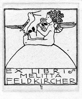
Another student at the same Kunstgewerbeschule was Berthold Loeffler (1874–1960). He took over a professorship in 1907, after Carl Otto Czeschkas’ move to Berlin. He taught art classes and held a workshop for print technology. He was a professor at the school until 1935. In addition to ceramic works, which he created together with Michael Powolny and the “Viennese Ceramics” – he applied himself to a variety of graphic works, such as book illustration, postcard design, posters, and general design. Loeffler created only a few exlibris, among them the two important and well known bookplates for psychoanalyst Sigmund Freud of Vienna and the poet Arthur Schnitzler. The ex libris for Loeffler’s wife Melitta (born Feldkirchner) is a beautiful example of the effortless, succinct style expressed by artists in the WW. His wife, often Loeffler’s model, was also an artist, known for her embroideries, which she designed and crafted in collaboration with the WW.

Oskar Kokoschka (1886-1980) was a student of Berthold Loeffler at the Kunst-gewerbeschule and in the early years of his artistic career Kokoschka was strongly influenced by him. He outgrew his teachers and colleagues as a painter, as a graphic artist and as a man of letters. Kokoschka worked for the WW from 1907 to 1909 and also participated as a staff member in the Fledermaus décor. Kokoschka designed 15 postcards and several prints, and caused a sensation with the above mentioned story-book, “Die Träumenden Knaben” (“Boys Dreaming”) featuring eight magnificent lithographs.

Kokoschka’s ex libris for Emma Bacher shows his expressionistic, revolutionary style, which for Austria around that time was quite remarkable. The bookplate was displayedin the yearbook of the Oestereichische Exlibrisgesellschaft in 1909 as a sample of Kokoschka’s art work, and was received with spontaneous praise: “Perhaps this sorcerer’s apprentice will one day be revered as an old master.” Though Kokoschka lived a long time, he left only fourteen exlibris prints.

Emma Bacher was the wife of the Viennese jeweler and wealthy patron of the arts, Paul Bacher. Bacher acquired his gallery in 1904 to accommodate the Klimt-faction which had split with the Secession - to give them a showroom. In 1907, after the death of her husband, Emma Bacher took over the gallery and further cultivated the contact with its artists: Gustav Klimt, Kolo Moser, Alfred Roller, Emil Orlik, and others. Thus the contact to Oskar Kokoschka was established here as well.

The Vienna Workshop, VI


Emma Bacher was also familiar with Richard Teschner (1879–1948) and married him in 1911. Teschner studied in Prague at the Kunstakademie (Academy of the Arts) and in 1900 briefly attended classes at the Kunstgewerbeschule in Vienna. He became wellknown for his puppet-shows, exhibiting his famous “Figurenspiel” (bodies reflected in a mirror), modeled on East-Asian culture. The Marionetten-Buehne (Puppet Theater) is alive today at the Theatermuseum in Vienna, and performances continue in the Teschner “Spiel” tradition. Teschner’s relocation to Vienna in 1909 was intimately connected with the WW. His work there included postcards, sculptures, metal works and book illustration. Free from financial responsibilities through his marriage to Emma Bacher, he joined the Klimt-circle, but did not identify himself with their spirit of revolutionary freedom, which to him seemed rather dogmatic. He remained true to his own style, which is more figurative, with playful ornaments of a grotesque and fantastic subject matter.

Like many other artists, Richard Teschner was multi-talented: a painter-engraver, a costume designer, and lute builder. He worked in different graphic-techniques, such as book illustration, posters, and numerous ex libris. One hundred and nine bookplates were found in his estate. The exlibris for Professor Arnold Epstein (1904) was made in his early days in Prague.

Anton Kling was a contemporary of Teschner (1881–1963). He received his education at the Kunstgewerbeschule between 1898 and 1903. His teachers were Josef Hoffmann and Alfred Roller. Kling belonged to the first generation of students who were taught by modern teachers of that institution, and who later became active in the Vienna art scene. Some of these art-students later became teachers and went on to teach not only in Austria’s Crown Lands, but also in neighboring Germany, where they successfully passed on the original Viennese art to their students.

One of them, the first Viennese at the Kunstgewerbeschule in Hamburg, was Carl Otto Czeschka (1878–1960). He brought with him Richard Luksch and Franz Carl Delavilla; the latter held a position as a design-teacher in Magdeburg (1909) as well as in Hamburg. Josef Maria Olbrich was employed in Darmstadt, where he became co-founder of an artists-colony. In 1911 another Viennese, Emanuel Josef Margold (1889–1962) joined the colony.

Anton Kling came to Hamburg in 1908, a move that was mediated by Czeschka. In 1923 he went on to Pforzheim, where he gave new impulse to jewelry design.

The Vienna Workshop, VII


Anton Kling received recognition from Josef Hoffmann in his diploma, stating:
“his brilliant talent and resourcefulness in architectural design, as well as his taste and perception.” Kling played a part as a “decorative assistant” for the Fledermaus when working for WW. In 1908 his work was relevant in organizing the “Wiener Kunstschau” (Vienna Art Exhibition) where some of his ex libris’ – among his other works – were shown. Thirteen of his bookplates are well known. An early ex libris for the painter Magda Mautner von Markhof beautifully balances the ornamental element with a landscape.

One of the few artists who worked for the WW without preparation at the
Kunstgewerbeschule, was Dagobert Peche (1887–1929). He became interested in the arts and crafts movement after his studies at the Technische Universität (Institute of Technology) in Vienna; then as a student of architecture at the Wiener Akademie, which he left in 1911 to work as a freelance design artist. In 1915 he was invited by Josef Hoffmann to join the staff at the WW – where he was able to assert himself with his more playful, ornamental style – and prevail by giving critical new impulses. He also had important ideas for jewelry-, enamel-, tortoiseshell- and ivory design; and for metal-works and goldsmith-design. In the end his style prevailed in the entire production. Through export of WW’s merchandise, Peches also received name recognition abroad. Last but not least, he became the representative of the WW at their base in Zurich vom 1916 to 1918.

Dagobert Peche was also devoted to books and designed book-covers and some ex libris. The bookplate with his name shows how Peche’s style changed since the first decade at the WW, in which the geometric style was replaced with freer graphics.
His bookplate for Wilhelm Baumgartner shows an aging harlequin in front of a curtain, and the rhombs in his costume highlight the black and white contrast.

Another artist who needs to be mentioned in connection with the WW is the type designer Rudolf von Larisch (1856–1934). He was a consultant to the WW from the beginning, and the typeface used by the WW for forms, invitations, announce-ments, etc., shows his influence. WW’s famous company emblem from 1903 and Larisch’s ex libris clearly show the same type font design. Larisch began teaching at the Kunstgewerbeschule in 1902, at the Graphic “Lehr- und Versuchsanstalt,” and at the Wiener Academie and he applied himself to the theoretical and practical side of letters. He wrote numerous important essays about, for example, writing as related to art, and the legibility of ornamental letters. Larisch was an important proponent of the reformation of the art of writing. By developing a new style of writing, he set a benchmark for its daily requirement. Readability was his maxim; theoretical studies, the layout of letters, the connectedness of letter-endings and the meaning of the spacing between letters have supported his theory. His teaching was not only about type design, but most of all to promote the appreciation for new type fonts. His importance was the expansion of this vision and its acceptance for daily use.

The Vienna Workshop VIII


One can name many more artists who, on one hand made their contributions to the Wiener Werkätte, but who also created ex libris. To list them all would go beyond the scope of this essay. It has to be said, however, that the style to which the artists of WW felt committed, lives on to this day in its effectiveness and good taste; moreover, the era still greatly affects our sense of style and it is an important part of the cultural identification in central Europe.


Literature:

Peter Vergo: Art in Vienna 1898 – 1918. London : Phaidon Press, 1975.
Werner J. Schweiger: Wiener Werkstätte, Kunst und Handwerk, 1903–1932. Wien : Edition Christian Brandstätter, 1982. English version published by Thames & Hudson.
Michael Pabst: Wiener Graphic um 1900. Munchen : Verlag Silke Schreiber, 1984.
Werner J. Schweiger: Aufbau und Erfüllung. Gebrauchsgraphic der Wiener Moderne. Wien-Munchen : Edition Christian Brandstätter, 1988.
Heinrich R. Scheffer: 100 Jahre Österreichisches Exlibris. Wien : Österreichische
Exlibris Gesellschaft/Österreichischer Kunst- und Kulturverlag, 2004.
Jahrbücher der Österreichischen Exlibris Gesellschaft: 1907, 1909, 1910, 1912, 1918, 1929, 1949/51, 1992/93.

Picture credits: Scheffer Collection, Vienna, Austria.

About the author: Heinrich R. Scheffer, born in 1942, studied chemistry in Vienna.
He has lived abroad for 17 years and is presently a Manager in a globally operating chemical company, with an office in Munich. For 33 years he has devoted his free time to collecting, publishing and organizing events connected to exlibris and contemporary Austrian art graphics. Between 1987 and 1991 he supported the development of Austrian art graphics by establishing and organizing the contest “FINGERPRINTS” for young artists. He has been President of the Österreichische

Exlibris Gesellschaft (Austrian Ex Libris Society) since 2000. He lives and works in Munich and Vienna.

Tuesday, November 10, 2009

Regarding Bookplates I


Regarding Bookplates

By

Ralph Fletcher Seymour

It is a pleasant experience, on opening a book, to find a bookplate on the inside cover. On such an occasion the discoverer is predisposed in their favor, as he holds in his eager hands a book, a veritable mirror of life, and the label is in its way a more or less bright mirror of the owner’s life. Bookplates are, in this way, a pleasant episode, much like a lovely landscape seen in the course of a long trip, and remain a half defined but pleasant help to the business of living thru the day.

It has become the custom to elaborate a simple label by enriching the design with items expressive of the taste, personality or fancy of the owner. This procedure should make a more beautiful and desirable thing out of a plain and serviceable label. It, first of all, should set forth the owner’s name, perhaps his residence, and may serve to inform the observer of the profession, avocation or special interests of the possessor, thus becoming a contribution to the book in which they appear. Realizing so glorious a destiny is not one of the smallest of achievements for few things which crows into the pages of a book actually have earned so fair a distinction, but bookplates have been used for hundreds of years and, like old wine and old friends, have arrived at a spiritual development both precious and rare.

At the time of their origin they, in a measure, filled the place of those painted and carved covers or bindings which bore the coat of arms, initials, or other emblem of the owner. They became a feature in books when printing became the handmaid of democracy and books were no longer written by scribes in exclusive scriptoriums for rich churches or for great nobles. The earliest known bookplate came from Germany. It is a woodcut of a hedgehog among flowers possibly the author’s playful picturegraph of himself among his books. All the early ones were either etched on copper or cut in wood and, printed on paper, were pasted on the first page of books or on the inside front cover if the books were in permanent bindings. At that date they were mostly armorial designs the “Ex Libris” did not appear nor that matter did the name of the owner often show.

Germany, France and England in manner typical of their natures, developed their own design in bookplates. A hundred years or so ago they were all engraved or etched and there are periods in their development as there are styles of architecture, ships, and armorials. I could never feel more than a weak enthusiasm for the typical engraved armorial bookplate: the idea of personality lost in the family, which these plates presented, gave a minimum of hope to the creative artist, although there are occasional fine plates such as George W. Eve used to design, dignified and well proportioned, with finely handled shields, mantling, ribbons and lettering.

Regarding Bookplates II


All sorts of material is serviceable for the factual part of bookplates. Entrance gates, houses, fireplaces, libraries, whimsical or literary ideas, fishing or hunting, golf, sailing, not to mention armorial, typographical and other styles, all are motifs that serve as material on which to base a bookplate design. In fact it seems to be of little importance what the subject may be and of much importance how it is used. The most significant development in bookplates has been the markedly finer quality of the art and design evident in modern work. At the commencement of their history and now again, having passed through a long period of mediocrity, typical bookplates are excellent in design and require first rate and creative artists to design them.

It is desirable that well designed bookplates accentuate the manner in which they have been reproduced, whether woodcut, line engraving, halftone or collotype, and the more nearly this method is expressive of the craft to typography the more proper is the mechanical part of the print. Perhaps the least used method at present and perhaps the best is the woodcut, when done in the very early manner and by a good craftsman. Plates, so reproduced, present the peculiarly harmonious appearance of works of art, showing the little marks of the cutting tool characteristic of the woodcut. The same may be said for the engraved or etched plate. Halftones and collotype tend to erase these marks. Line drawings, which are reproduced mechanically into zinc printing plates often are too much reduced from the original drawing to keep any character, or have too much solid black or lines too thin and stringy, and are therefore often disappointing.

Regarding Bookplates III


Bookplates are meant to appear only with printed books and should appear to have been produced under conditions similar to those under which books are made. The observance of this rule would improve the character of plates designed by first rate artists, whose plates sometimes seem to more nearly express the character of illustrations or painting than of typographical designs.

An example of a period plate is here shown in the Racquet Club label. It is interesting because in style it is accurate and there is a good balance and proportion between the animated group and the decoration.

Differing completely in plan and execution is the John Timothy Stone plate, it presents the happy hunting ground of a fisherman both of the souls of men and trout. The design is entirely naturalistic.

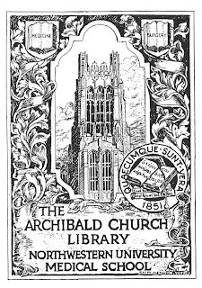
The Union League Club plate is a combination of picture and of decoration, and is interesting historically because it portrays periods in the development of Chicago. The Archibald Church Library Plate is a modern institutional plate in the pictorial manner superior to the usual plate of this character.

Regarding Bookplates IV


These four labels are all from copper etched plates. The bitten lines and tone secured from intaglio lines and from wiping the plate give a delicacy not otherwise obtained. Quite different in character are the two heavily drawn printed plates. That of Edna Kircher is an allegorical design and portrays the ever-recurring difficulty into which men are innocently precipitated by the eternal woman who will not leave the gnarled old Tree of Knowledge alone. Beyond in the pleasant valley lie all vanities swept by clean winds of heaven. That faithful recorder of the joys and griefs of humanity, a book, appears in the design. The woodcut plate of the turtle and shield also has a tree for its major motif. Both these plates are designed to be printed from blocks.

Beginning with the Bruce plate more than twenty five years ago, Mr. Seymour has designed a considerable number of Ex Libris labels and his studio is seldom without several in process of etching or to be made for letter press printing. It is a pleasure to thus contribute in a small degree to the bibliophilic pleasures of a few who, having yielded to the seduction of books, have then plunged more deeply into the esoteric indulgence of “getting a bookplate”.